
Why must quality bankable podcasts change their logos?
This truly is the golden age of podcasts. Though they’ve technically been around for many years, the last 4-5 years really saw an explosion of amazing content: non-fiction, investigative journalism, fiction, horror, true crime, you name it.
I’ve been a junkie for a long time now. So much so that I notice when my favorites make format changes. Even alterations to their “cover art” or logos can be unsettling to the die-hard fans.
Take the show Reply All for instance. They started with the really well-designed pixelated graphic of the email icon. It’s subtle and brilliant. But then they inexplicably changed to this utterly generic pastel landscape thing. Then more recently — probably responding to much backlash — they changed again to what only can be described as a cover art of a lost techno album. It’s less offensive, but equally unexpected. See the progression below:


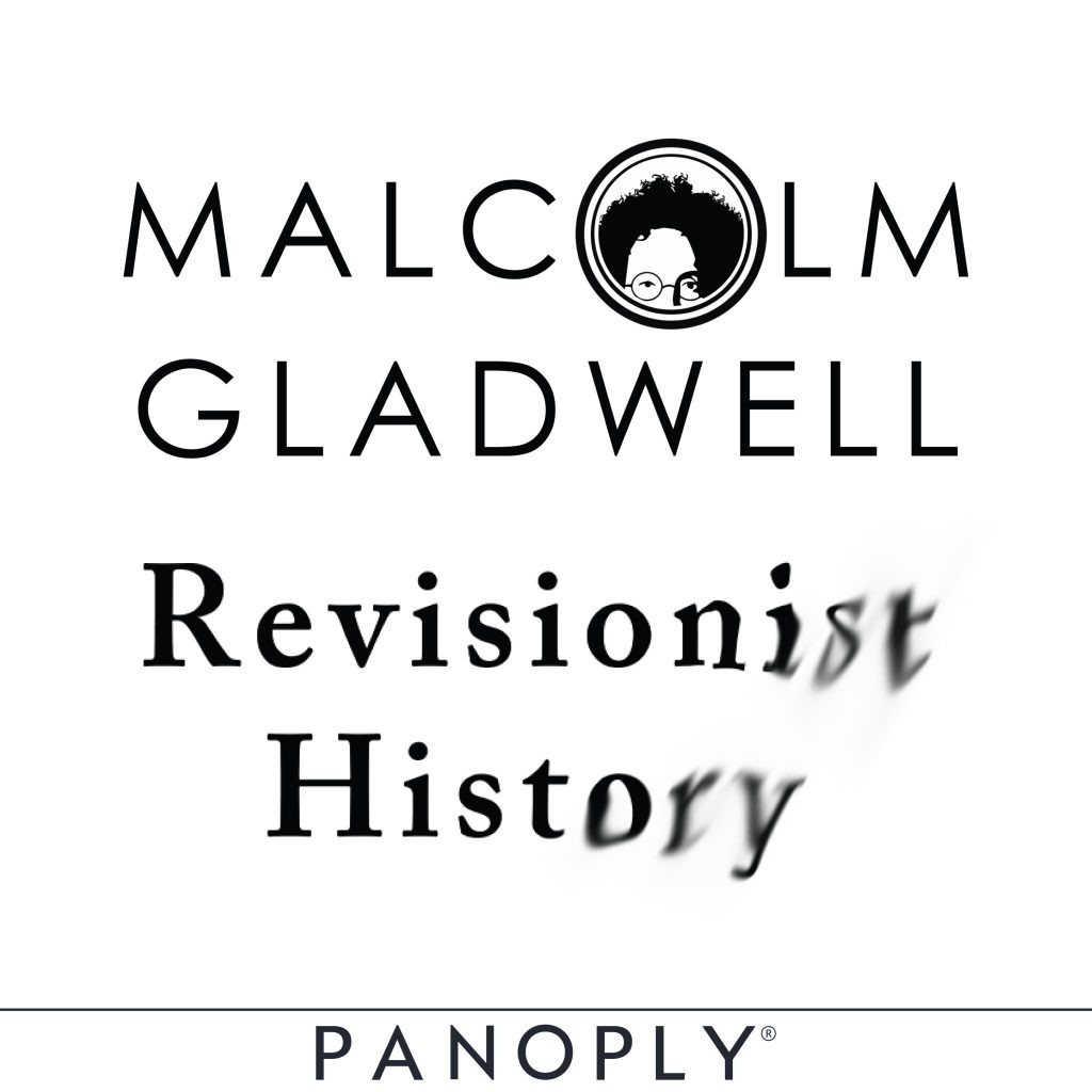
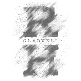
Next up is the excellent Revisionist History by Malcolm Gladwell, author of Blink, Outliers, and other books. This one too, in my opinion, got worse after the logo update. The first logo evoked a sort of image that reflected the content — the blurring, bleeding letters at the end of “revisionist” and “history”. The new logo is just very bland.
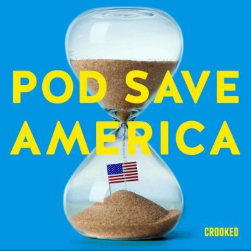
The final example is less off-putting. The incredible leftist podcast Pod Save America had such a great original log, that of Washington with earbuds. That mashup of imagery is priceless and perfect.
The update is appropriate for the season: Trump’s re-election bid. It is a very different image, though appropriate.
Leave a Reply